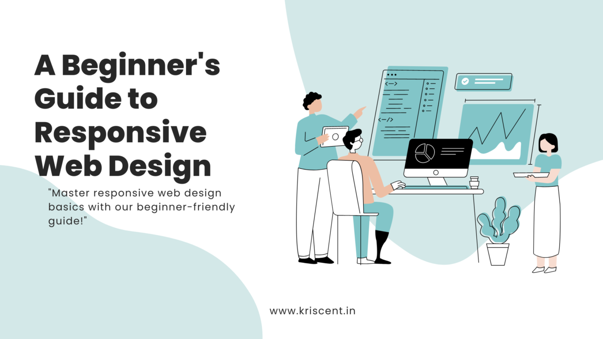
Having a website that works and appears great on every device in today’s digital world is crucial. This is where responsive web design (RWD) comes in handy. RWD ensures that your website adapts to different screen dimensions and orientations, providing a seamless experience for users on pc, tablets, or smartphones. This is an easy guide for understanding and implementing responsive web design for newcomers.
What is Responsive Web Design?
Creating web pages that adjust to the device they’re viewed on is referred to as responsive web design. This is achieved through the use of images, CSS media queries, and flexible grids and layouts.
Key Principles of Responsive Web Design
1. Dynamic Grids: Dynamic grids employ percentages instead of rigid-sized designs. This allows elements to resize relative to the display’s dimensions.
2. Adaptive Pictures: To maintain the structure of the design, pictures need to resize within their designated areas.
3. Device-Specific Media: The appearance of media varies based on the characteristics of the device, including the size of the screen, its height, and its orientation.
Why is Responsive Web Design Important?
1. Better User Experience: Extended engagement times and reduced exit rates are achievable with a website that offers a seamless and enjoyable experience for users on any device.
2. Increased Mobile Traffic: More individuals are opting to use their mobile devices to browse websites. By adopting a responsive layout, you can attract and retain this demographic.
3. Advantages in Search Engine Optimization: A responsive layout can improve your website’s visibility on search engines, as search engines such as Google favor sites that are optimized for mobile.
4. Affordability: It’s more economical and simpler to manage a single responsive website compared to creating and maintaining separate versions for pc and mobile.
How to Implement Responsive Web Design
1. Mobile-First Approach
Start with the smallest screen dimensions when creating your design. This ensures your website functions perfectly on smartphones and then enhances the user experience on larger screens.
/* Basic mobile-first styling */
body {
font-size: 16px;
line-height: 1.5;
margin: 0;
padding: 0;
2. Fluid Grid Layout
To create a design that adapts to different screen dimensions, opt for percentages instead of set widths.
/* Fluid grid layout example */
.container {
width: 100%;
max-width: 1200px;
margin: 0 auto;
padding: 0 15px;
}
.row {
display: flex;
flex-wrap: wrap;
}
.column {
flex: 1;
padding: 15px;
}
3. Flexible Images
To prevent issues with the design on different screen sizes, ensure that images adjust to fit within their designated areas.
/* Flexible images example */
img {
max-width: 100%;
height: auto;
}
4. Media Queries
To tailor specific designs according to the device’s characteristics, implement media queries. Begin with a simple design for smaller screens and introduce modifications at specific intervals.
/* Media queries example */
@media (min-width: 600px) {
.column {
flex: 50%;
}
}
@media (min-width: 992px) {
.column {
flex: 33.33%;
}
}
5. Testing Across Devices and Browsers
To ensure your design works across all platforms and web browsers, it’s crucial to carry out testing. Use tools like Chrome to simulate different screen dimensions and devices. Moreover, whenever feasible, perform tests on actual devices.
6. Optimizing for Performance
Enhancing the responsiveness of design is also essential to ensure rapid loading speeds on every device. This involves:
-
- Reducing CSS and JavaScript: Eliminate unnecessary code and compress your files with various tools.
-
- Optimizing image formats and compression techniques: Choose the appropriate formats and methods for image optimization.
- Utilizing content delivery networks (CDNs): Employ a CDN to distribute static content, which will accelerate the loading process.
7. Accessibility Considerations
Ensure that your responsive layout is accessible to individuals with disabilities as well as to all other users. This involves:
Organizing your HTML content in a meaningful way will enhance its accessibility.
Keyboard Navigation: Check that your website can be navigated using a keyboard.
Screen Reader Readability: To boost the readability for screen readers, incorporate ARIA (Accessible Rich Internet Applications) elements.
Conclusion
Creating websites that offer a great experience for users on every device demands responsive web design. Whether it’s through accessibility, you can ensure your website is attractive and works well by following specific rules and steps. It’s crucial to continually test and enhance your design to keep pace with the evolving nature of the web. Enjoy the process of making!
Thank you for reading our blog and if you want to read about Exploring the Latest Trends in Mobile App Design for 2024 then read this blog.

%20(1)%201.webp?updatedAt=1725274383969)


My family always say that I am killing my time here at web, but I know I am getting familiarity daily by reading thes nice
posts.
It’s perfect time to make some plans for the future and it is time to be
happy. I’ve read this post and if I could I want to suggest you few interesting things or
suggestions. Maybe you can write next articles referring to this article.
I wish to read more things about it!
whoah this weblog is magnificent i really like
studying your posts. Stay up the good work!
You understand, lots of individuals are searching around
for this information, you can aid them greatly.
Your key to unforgettable victories!
Are you looking for a platform where you can not only relax,
but also win big?
What we offer:
conline casinos
sports betting
gambling
online betting
gambling
Instant Wins: Our games are designed specifically for you.
Quick rounds, instant results and real chances of winning!
Bonuses and Promotions: Get even more thanks to our
generous bonuses and promotions. Regular updates and special
offers ensure that every day will be full of surprises.
Simplicity and accessibility: Play whenever it’s convenient for you – our website works smoothly on all devices.
Simple registration and fast payouts will make
your experience enjoyable and hassle-free.
Security: We take care of your privacy and safety. The site
uses the latest data protection technology so that you can focus on the game.
Join now and start winning!
Thanks for a marvelous posting! I certainly enjoyed reading it, you will be a great author.
I will ensure that I bookmark your blog and definitely will come back in the foreseeable future.
I want to encourage you to definitely continue your great posts,
have a nice weekend!
Hey there I am so delighted I found your blog page,
I really found you by mistake, while I was browsing on Yahoo for something else, Anyhow I am here now and
would just like to say kudos for a marvelous post
and a all round thrilling blog (I also love the theme/design), I don’t have time to read it all at the moment but I
have book-marked it and also added your RSS feeds,
so when I have time I will be back to read a lot more,
Please do keep up the fantastic job.
Very nice article. I absolutely appreciate this site. Stick
with it!
This site was… how do you say it? Relevant!!
Finally I’ve found something that helped me. Thanks!
Hey would you mind letting me know which webhost you’re utilizing?
I’ve loaded your blog in 3 completely different
web browsers and I must say this blog loads a lot quicker then most.
Can you suggest a good hosting provider at a fair price?
Cheers, I appreciate it!
[…] you for reading our blog and if you want to read about A Beginner’s Guide to Responsive Web Design then read this […]
My family every time say that I am killing my time here at web,
but I know I am getting know-how every day by reading thes fastidious articles or reviews.
It’s great that you’re finding value in reading articles and reviews online! The internet is a powerful tool for learning and expanding your knowledge. As long as you’re balancing it with other important activities, gaining insights and staying informed is definitely a productive way to spend your time. Keep exploring and learning!
No matter if some one searches for his essential thing,
therefore he/she needs to be available that in detail,
therefore that thing is maintained over here.